Progressive web apps are a way to bring native app feeling into normal or traditional web apps. Indeed, with PWAs we can now enhance our website with mobile app features which increase a lot the usability and offer great user experience to our end-users.
In this article, we are going to build a PWA from scratch with HTML, CSS, and JavaScript. So, let's get started by an important question: What the heck is PWA?
Sorry for the interrupt!
If you're interested in learning JavaScript in a comprehensive way, I highly recommend this course: JavaScript - The Complete Guide 2020 (Beginner + Advanced)
It's an affiliate link, so by purchasing, you support the blog at the same time.- What is Progressive Web App (PWA)?
- Markup
- Styling
- Show data with JavaScript
- Web App Manifest
- Register the Service Worker
- Final thoughts
- Next steps
What is Progressive Web App (PWA)?
A Progressive Web App is a web app that delivers an app-like experience to users by using modern web capabilities. In the end, it's just your regular website that runs in a browser with some enhancements like the ability:
- To install it on a mobile home screen
- To access it when offline
- To access the camera
- Get push notifications
- To do background synchronization
And so much more.
However, to be able to transform our traditional web app to a PWA, we have to adjust it a little bit, by adding a web app manifest file and a service worker.
Don't worry about these new terms, we'll cover them later.
But First, we have to build our web app or traditional web app if you want too. So, Let's start with the markup.
Markup
The HTML file is relatively simple. We wrap everything on the main tag.
- In
index.html
<!DOCTYPE html>
<html lang="en">
  <head>
    <meta charset="UTF-8" />
    <meta name="viewport" content="width=device-width, initial-scale=1.0" />
    <meta http-equiv="X-UA-Compatible" content="ie=edge" />
    <link rel="stylesheet" href="css/style.css" />
    <title>Dev'Coffee PWA</title>
  </head>
  <body>
    <main>
      <nav>
        <h1>Dev'Coffee</h1>
        <ul>
          <li>Home</li>
          <li>About</li>
          <li>Blog</li>
        </ul>
      </nav>
      <div class="container"></div>
    </main>
    <script src="js/app.js"></script>
  </body>
</html>
And create a navigation bar with the nav tag. Then, the div with the class .container will hold later our cards added by JavaScript.
That being said, let's style it with CSS.
Styling
Here, as usual, we start by importing the needed font and do some resets to prevent the default behavior.
- In
css/style.css
@import url("https://fonts.googleapis.com/css?family=Nunito:400,700&display=swap");
* {
  margin: 0;
  padding: 0;
  box-sizing: border-box;
}
body {
  background: #fdfdfd;
  font-family: "Nunito", sans-serif;
  font-size: 1rem;
}
main {
  max-width: 900px;
  margin: auto;
  padding: 0.5rem;
  text-align: center;
}
nav {
  display: flex;
  justify-content: space-between;
  align-items: center;
}
ul {
  list-style: none;
  display: flex;
}

li {
  margin-right: 1rem;
}
h1 {
  color: #e74c3c;
  margin-bottom: 0.5rem;
}
Then, we limit the main element's maximum width to 900px, to make it look good on a large screen.
For the navbar, I want the logo to be at the left and the links at the right. Hence, for the nav tag, after making it a flex container, we use justify-content: space-between; to align them.
- In
css/style.css
.container {
display: grid;
grid-template-columns: repeat(auto-fit, minmax(15rem, 1fr));
grid-gap: 1rem;
justify-content: center;
align-items: center;
margin: auto;
padding: 1rem 0;
}
.card {
display: flex;
align-items: center;
flex-direction: column;
width: 15rem auto;
height: 15rem;
background: #fff;
box-shadow: 0 10px 20px rgba(0, 0, 0, 0.19), 0 6px 6px rgba(0, 0, 0, 0.23);
border-radius: 10px;
margin: auto;
overflow: hidden;
}
.card--avatar {
width: 100%;
height: 10rem;
object-fit: cover;
}
.card--title {
color: #222;
font-weight: 700;
text-transform: capitalize;
font-size: 1.1rem;
margin-top: 0.5rem;
}
.card--link {
text-decoration: none;
background: #db4938;
color: #fff;
padding: 0.3rem 1rem;
border-radius: 20px;
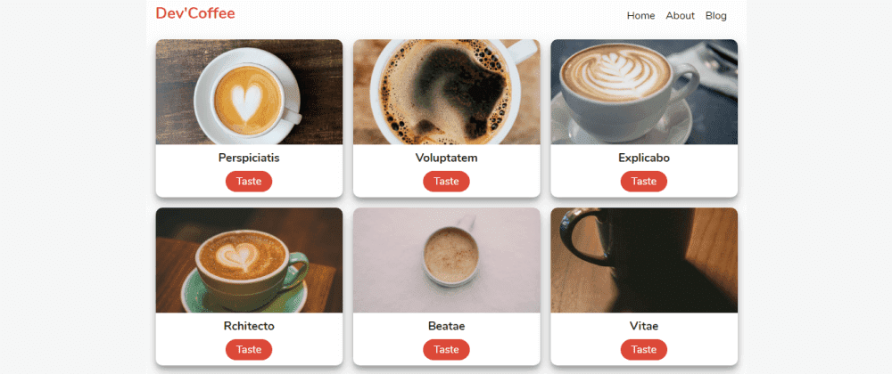
}We'll have several cards, so, for the container element it will be displayed as a grid. And, with grid-template-columns: repeat(auto-fit, minmax(15rem, 1fr)), we can now make our cards responsive and let them use at least 15rem as width if there is enough space and 1fr if not.
And to make them look nice we double the shadow effect on .card class and use object-fit: cover on .card--avatar to prevent the image stretching.
So, now it looks much better but we still not have data to show.
Let's fix it in the next section
Show data with JavaScript
Notice that I used large images that take some time to load. To just show you in the best way the power of service worker.
As I said earlier, the .container class will hold our cards. Therefore, we need to select it.
- In
js/app.js
const container = document.querySelector(".container")
const coffees = [
  { name: "Perspiciatis", image: "images/coffee1.jpg" },
  { name: "Voluptatem", image: "images/coffee2.jpg" },
  { name: "Explicabo", image: "images/coffee3.jpg" },
  { name: "Rchitecto", image: "images/coffee4.jpg" },
  { name: " Beatae", image: "images/coffee5.jpg" },
  { name: " Vitae", image: "images/coffee6.jpg" },
  { name: "Inventore", image: "images/coffee7.jpg" },
  { name: "Veritatis", image: "images/coffee8.jpg" },
  { name: "Accusantium", image: "images/coffee9.jpg" },
]
Then, we create an array of cards with names and images.
- In
js/app.js
const showCoffees = () => {
  let output = ""
  coffees.forEach(
    ({ name, image }) =>
      (output += `
              <div class="card">
                <img class="card--avatar" src=${image} />
                <h1 class="card--title">${name}</h1>
                <a class="card--link" href="#">Taste</a>
              </div>
              `)
  )
  container.innerHTML = output
}

document.addEventListener("DOMContentLoaded", showCoffees)
With this code above, we can now loop through the array and show them on the HTML file. And to make everything work, we wait until the DOM (Document Object Model) content finished load to run the showCoffees method.
We've done a lot, but for now, we just have a traditional web app. So, let's change that in the next section by introducing the PWA features.
Web App Manifest
The web app manifest is a simple JSON file that informs the browser about your web app and how it should behave when installed on the user's mobile device or desktop. And to show the Add to Home Screen prompt, the web app manifest is required.
Now we know, what a web manifest is, let's create a new file named manifest.json (you've to name it like that) in the root directory, and add this code block below.
- In
manifest.json
{
  "name": "Dev'Coffee",
  "short_name": "DevCoffee",
  "start_url": "index.html",
  "display": "standalone",
  "background_color": "#fdfdfd",
  "theme_color": "#db4938",
  "orientation": "portrait-primary",
  "icons": [
    {
      "src": "/images/icons/icon-72x72.png",
      "type": "image/png", "sizes": "72x72"
    },
    {
      "src": "/images/icons/icon-96x96.png",
      "type": "image/png", "sizes": "96x96"
    },
    {
      "src": "/images/icons/icon-128x128.png",
      "type": "image/png","sizes": "128x128"
    },
    {
      "src": "/images/icons/icon-144x144.png",
      "type": "image/png", "sizes": "144x144"
    },
    {
      "src": "/images/icons/icon-152x152.png",
      "type": "image/png", "sizes": "152x152"
    },
    {
      "src": "/images/icons/icon-192x192.png",
      "type": "image/png", "sizes": "192x192"
    },
    {
      "src": "/images/icons/icon-384x384.png",
      "type": "image/png", "sizes": "384x384"
    },
    {
      "src": "/images/icons/icon-512x512.png",
      "type": "image/png", "sizes": "512x512"
    }
  ]
}
In the end, it's just a JSON file with some mandatory and optional properties.
- name: When the browser launches the splash screen, it will be the name displayed on the screen.
- short_name: It will be the name displayed underneath your app shortcut on the home screen.
- start_url: It will be the page shown to the user when your app is open.
- display: It tells the browser how to display the app. They are several modes like
minimal-ui,fullscreen,browseretc. Here, we use thestandalonemode to hide everything related to the browser. - background_color: When the browser launches the splash screen, it will be the background of the screen.
- theme_color: It will be the background color of the status bar when we open the app.
- orientation: It tells the browser the orientation to have when displaying the app.
- icons: When the browser launches the splash screen, it will be the icon displayed on the screen. Here, I used all sizes to fit any device's preferred icon. But you can just use one or two. It's up to you.
Now, we have a web app manifest, let's add it to the HTML file.
- In
index.html(head tag)
<link rel="manifest" href="manifest.json" />
<!-- ios support -->
<link rel="apple-touch-icon" href="images/icons/icon-72x72.png" />
<link rel="apple-touch-icon" href="images/icons/icon-96x96.png" />
<link rel="apple-touch-icon" href="images/icons/icon-128x128.png" />
<link rel="apple-touch-icon" href="images/icons/icon-144x144.png" />
<link rel="apple-touch-icon" href="images/icons/icon-152x152.png" />
<link rel="apple-touch-icon" href="images/icons/icon-192x192.png" />
<link rel="apple-touch-icon" href="images/icons/icon-384x384.png" />
<link rel="apple-touch-icon" href="images/icons/icon-512x512.png" />
<meta name="apple-mobile-web-app-status-bar" content="#db4938" />
<meta name="theme-color" content="#db4938" />
As you can see, we linked our manifest.json file to the head tag. And add some other links which handle the IOS support to show the icons and colorize the status bar with our theme color.
With that, we can now dive into the final part and introduce the service worker.
What is Service Worker?
Notice that PWAs run only on https because the service worker can access to the request and handle it. Therefore the security is required.
A service worker is a script that your browser runs in the background in a separate thread. That means it runs in a different place, it's completely separate from your web page. That's the reason why it can't manipulate your DOM element.
However, it's super powerful. The service worker can intercept and handle network requests, manage the cache to enable offline support or send push notifications to your users.
That being said, let's create our very first service worker in the root folder and named it serviceWorker.js (the name is up to you). But you have to put it in the root to not limit its scope to one folder.
Cache the assets
- In
serviceWorker.js
const staticDevCoffee = "dev-coffee-site-v1"
const assets = [
  "/",
  "/index.html",
  "/css/style.css",
  "/js/app.js",
  "/images/coffee1.jpg",
  "/images/coffee2.jpg",
  "/images/coffee3.jpg",
  "/images/coffee4.jpg",
  "/images/coffee5.jpg",
  "/images/coffee6.jpg",
  "/images/coffee7.jpg",
  "/images/coffee8.jpg",
  "/images/coffee9.jpg",
]

self.addEventListener("install", installEvent => {
  installEvent.waitUntil(
    caches.open(staticDevCoffee).then(cache => {
      cache.addAll(assets)
    })
  )
})
Here, it looks intimidating first but it just JavaScript (don't worry).
We declare the name of our cache staticDevCoffee and the assets to store in the cache.
And to perform that action, we need to attach a listener to self.
self is the service worker itself. It enables us to listen to life cycle events and do something in return.
The service worker has several life cycles, and one of them is the install event. It runs when a service worker is installed.
It's triggered as soon as the worker executes, and it's only called once per service worker.
When the install event is fired, we run the callback which gives us access to the event object.
Caching something on the browser can take some time to finish because it's asynchronous.
So to handle it, we need to use waitUntil() to as you might guess, waiting for the action to finish.
Once the cache API ready, we can now run the open() method and create our cache by passing its name as an argument to caches.open(staticDevCoffee).
Then, it returns a promise, which helps us store our assets in the cache with cache.addAll(assets).

Hopefully, you're still with me.
Now, we successfully cached our assets on the browser. And the next time we load the page, the service worker will handle the request and fetch the cache if we are offline.
So, let's fetch our cache.
Fetch the assets
- In
serviceWorker.js
self.addEventListener("fetch", fetchEvent => {
  fetchEvent.respondWith(
    caches.match(fetchEvent.request).then(res => {
      return res || fetch(fetchEvent.request)
    })
  )
})
Here, we use the fetch event to, well, get back our data. The callback gives us access to fetchEvent, then we attach respondWith() to prevent the browser's default response and instead it returns a promise. Because the fetch action can take time to finish.
And once the cache ready, we apply the caches.match(fetchEvent.request). It will check if something in the cache matches fetchEvent.request. By the way, fetchEvent.request is just our array of assets.
Then, it returns a promise, and finally, we can return the result if it exists or the initial fetch if not.
Now, our assets can be cached and fetched by the service worker which increases a lot the load time of our images.
And most important, it makes our app available on offline mode.
But a service worker only can't do the job, we need to register it in our project.
Register the Service Worker
- In
js/app.js
if ("serviceWorker" in navigator) {
  window.addEventListener("load", function() {
    navigator.serviceWorker
      .register("/serviceWorker.js")
      .then(res => console.log("service worker registered"))
      .catch(err => console.log("service worker not registered", err))
  })
}
Here, we start by checking if the serviceWorker is supported by the current browser. Because it's still not supported by all browsers.
Then, we listen to the page load event to register our service worker by passing the name of our file serviceWorker.js to navigator.serviceWorker.register() as a parameter to register our worker.
With this update, we have now transformed our regular web app to a PWA.
Final thoughts
Throughout this article, we have seen how amazing PWA can be. By adding a web app manifest file and a service worker, it increases a lot the user experience of our traditional web app. Because PWAs are fast, secure, reliable and the most important, they support offline mode.
Many frameworks out there comes now with a service worker file already set-up for us, however, knowing how to implement it with Vanilla JavaScript can help you understand PWAs. And you can go even further with service workers by caching assets dynamically or limit the size of your cache etc.. That being said, Thanks for reading this article.
You can check it live here
Source code here